
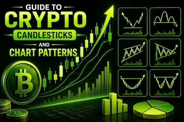
Crypto charting combines elements such as price action, volume, and market structure. However, an aspiring cryptocurrency trader can grasp crypto charts by looking at several key elements. The first thing that should be considered is the candlesticks, which display the opening, closing, high, and low prices for a specific timeframe, with timeframes indicating the amount of action within each of the candles.
Trend structure includes higher highs, higher lows, lower highs, and lower lows. The volume indicates the underlying trading activity of the price movements; Bitcoin dominance and Altcoin Season Index offer additional information on the market structure.
How to Read Crypto Chart Using Candlesticks
The candlestick represents four prices at each point in the time frame, which include open, high, low, and closing prices, known as OHLC. The body is shown through the difference between opening and closing prices, while the upper and lower tails are represented through the highest and lowest prices touched at each time frame.
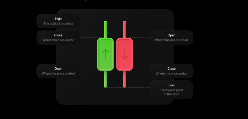
Source: Olymptradecom
The green candlestick implies a rise in the asset price as compared to its opening value, and a red candlestick implies the opposite scenario. An hour candle shows one hour of trading activity, while a daily candle shows a whole day.
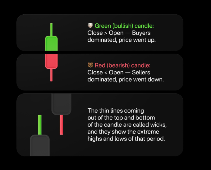
Source: Olymptradecom
A big body implies a substantial difference between the open and close.A long wick shows that price moved significantly beyond the body before returning. Neither of these characteristics is a predictor of the future, and the candles need to be analyzed together with all other information on the chart.
Timeframes may drastically affect how price behavior is perceived. The same cryptocurrency may be bullish on a 5-minute timeframe chart but underperform on a daily timeframe chart. Shorter timeframes tend to have more noise, while longer timeframes offer a larger picture of the market situation.
Common Patterns Describe Price Behavior
TradingView categorizes candlestick patterns as reversal, continuation and neutral formations and cautions that recognizable patterns are suggestions rather than guarantees.
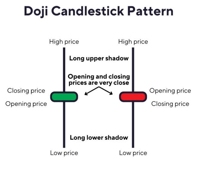
The formation of a doji indicates that the open and close price of that candlestick are very close. A hammer has a relatively small body and a long lower wick, showing that sellers pushed price lower before buyers recovered much of the decline.
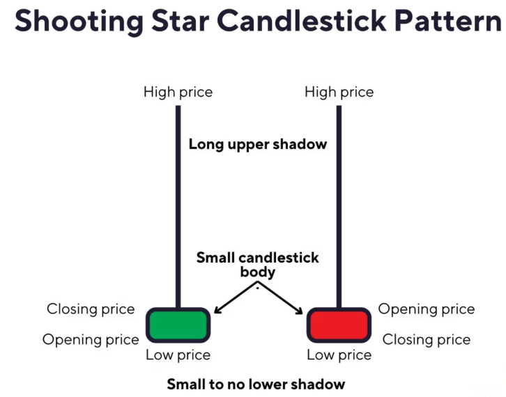
Source: Investingoal
A shooting star has a small body near the lower part of the candle and a relatively long upper wick. It can indicate that buyers pushed price higher before sellers moved it back toward the opening area.
Source: Investingoal
A bullish engulfing pattern generally has a smaller bearish candle followed by a larger bullish candle whose body covers the previous candle’s body. A bearish engulfing pattern reverses that arrangement. These formations describe changing buying or selling pressure rather than direct trading instructions.
Trend Structure and Volume Add Context
An upward trend consists of higher peaks and higher troughs, while a downward trend has lower peaks and lower troughs. A horizontal market is called a range and is characterized by price fluctuating within certain defined levels without making any significant movement.
Support refers to the region in which the price has encountered interest in buying in the past, while resistance refers to the region in which selling interest was seen before. These regions are not static barriers since the price can pass through them, and the previous support region becomes the resistance region in the future.
Volume is a measure of the amount of trading that happened along with the price movement. Large price movement with very high volume is strong confirmation that this price movement involved a lot of interest.
Volume can also provide context during breakouts from established ranges. However, it remains evidence rather than a predictive tool.
Key takeaways
- Candlesticks show open, high, low and close prices, while timeframes change their meaning.
- Trend structure and volume place individual price movements into broader context.
- Bitcoin dominance and the Altcoin Season Index offer broader indices for the market.
Bitcoin Dominance and Altcoin Season
Bitcoin dominance is the ratio of the market capitalization of Bitcoin against the total capitalization of the cryptocurrency market. The index reflects the share of Bitcoin in the total cryptocurrency market.
The ratio can rise in cases where Bitcoin grows faster than the other assets in the market and fall if other cryptoassets grow faster. The index does not show whether the price of Bitcoin will go up or down because the price of Bitcoin can rise while its dominance falls.
Altcoin Season Index is an index that measures the last 90 days of the performance of the first 100 eligible coins in CoinMarketCap compared to Bitcoin. If the index is 75 or more, then at least 75% of the coins beat Bitcoin in performance. An index of 25 or less indicates a Bitcoin season.
In July 2026, CoinMarketCap indicated that the index remained at 45-50 with Bitcoin dominance around 58%. A few strongly performing tokens do not necessarily constitute an altcoin season because the index measures broader outperformance.
Market Cycles Put Charts Into Perspective
Cycle-based market analysis takes prices into context of larger cycles of growth, decline, consolidation, and recovery. According to Glassnode on Aug. 17, Bitcoin was trading near $63,600 with some gains but remained stuck within a range due to poor spot liquidity and lack of market conviction.
According to Glassnode, Bitcoin continued to hover around the cycle lows below important cost-basis levels despite rising derivatives demand. These two contradictory facts highlight why a single snapshot of charts may not offer a complete picture of a cycle.
A practical process is to identify the asset and timeframe, determine whether the structure is rising, falling, or ranging, then examine support, resistance, candles, and volume.
| Tool | What it shows | Main use |
| Candlesticks | Open high low and close | Price behavior |
| Volume | Trading activity | Price context |
| Bitcoin dominance | Bitcoin’s market share | Market concentration |
| Altcoin Season Index | Altcoin performance versus Bitcoin | Market breadth |
Chart Reading Has Limits
Charts describe historical price and volume behavior rather than providing certainty about future prices. Technical analysis is unable to explain all such fundamentals, regulation, macroeconomic, and structural market events.
Regulation news, exchange failures, protocol exploits, macroeconomic data, and liquidity events may change the price action. For beginners, how to read crypto charts is therefore about understanding price behavior and uncertainty rather than turning every candle into a trading signal.
Conclusion
How to read crypto charts starts with candlesticks but extends to timeframes, trend structure, support and resistance, volume, and broader indicators.
Bitcoin Dominance and the Altcoin Season Index provide further information beyond each coin’s movement. These measures can help you understand what has happened in the market and point out the uncertainty, but not what will happen next.
FAQs
What does a crypto candlestick show?
Each candle records the open, high, low and close for a selected period.
Why do timeframes matter?
Various periods represent various amounts of market activity. Smaller periods tend to have more noise than larger periods.
What is bitcoin dominance?
Bitcoin dominance is Bitcoin’s market capitalization as a percentage of total cryptocurrency market capitalization.
What does the Altcoin Season Index measure?
It compares the rolling 90-day performance of CoinMarketCap’s top 100 eligible coins with Bitcoin.